Testing if your website looks right across devices shouldn’t require switching tabs and resizing windows.
Pixefy gives you everything you need to find, understand, and fix responsive issues—all from a single tab.
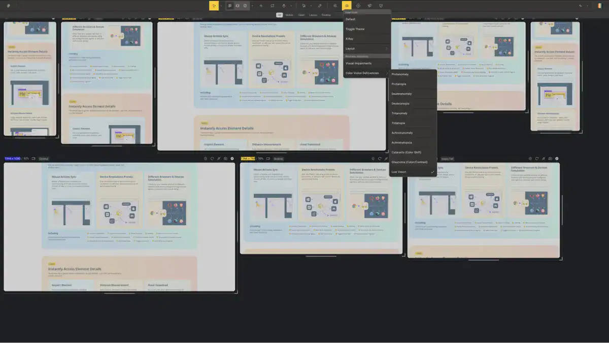
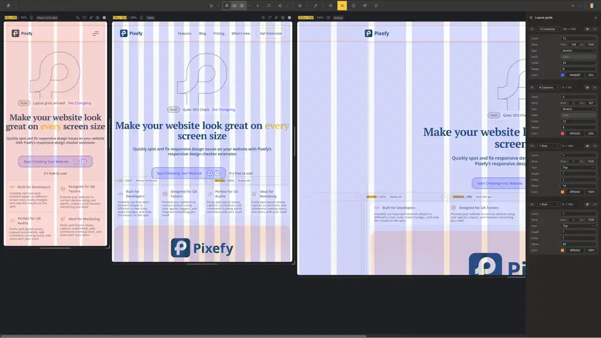
Catch breakpoints before anyone else does
- Apply adaptive grid overlays to any device view to check alignment, spacing, and layout consistency at a glance
- See every screen size at once with 300+ built-in device presets for iPhones, Android phones, tablets, and desktops—or add your own
- Sync scroll and click actions across all panes to test interactive elements across every breakpoint simultaneously
- Stack, reorder, and zoom device panes vertically or horizontally to match your exact workflow
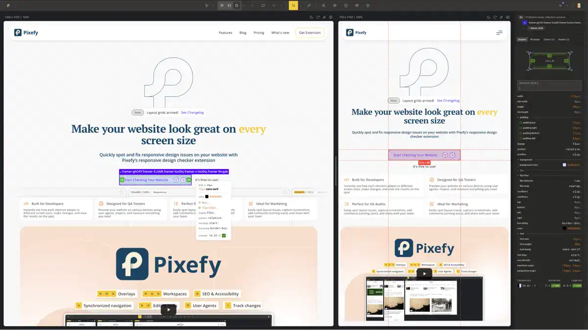
Edit any element with Pixefy
- Click any element to instantly surface its colors, sizes, margins, and padding in a clean visual breakdown
- Measure pixel distances between elements by selecting one and hovering over another—with values displayed in real time
- Edit any CSS value directly in the Inspect tool and watch changes apply live across your workspace
- Track every CSS and content edit in the Activity tab, so all your changes are logged in one place and easy to review or revert
Fix SEO issues in a snap
- Surface key on-page SEO data for any page, including meta tags, headings, image alt text, and canonical tags
- Identify missing or broken SEO elements on your pages before they affect your rankings
- Check how your site’s metadata renders across different device views simultaneously
- Export findings directly so you can act on them or share with your team without switching tools
Get lifetime access to Pixefy!